(Even if we should be moving away from forms altogether…)
By Margaret Hagan. (This piece was originally published on our Legal Design & Innovation publication).
I am thinking a lot about forms these days! At the Stanford Filing Fairness Project, our team is working on a near future in which PDF forms no longer are key to people’s access to the court system. In that vision, it’s all about moving from populating PDFs to gathering data fields and sending them straight from a user-friendly website to the court’s case management system. No PDF forms needed!
But we still live in a justice system full of PDF forms. Even when software exists to help people fill in forms, through logic trees and document assembly programs, still it’s all going through PDFs.
So… if we still have to live in a world of PDF forms, let’s make sure that this world is as accessible & empowering to as many people as possible. We still need to care about the design of PDF forms.
The Basics of Good Court Form Design
This morning I had the privilege to kick off the National Center for State Courts summertime webinar series: Forms Camp. Over 750 attendees showed up to learn how to design better court forms. Usually, I think of court form design as a super-specialized, design geek kind of topic. But it turns out that a lot of people are unhappy with their current form design, and want to make them better.
So what should you to design better forms? I had 3 main areas for work:
- Shift your form team’s point of view, from the institution-centered perspective to a people-centered perspective.
- Follow key visual design principles — as well as good court form design principles that I proposed, based on the Legal Design Lab’s work.
- Get started on a design process — in which multi-stakeholder groups, including community members, visual designers, lawyers, court staff, and others are reviewing current forms, sketching out new drafts, testing these prototypes, and finalizing the most successful ones.
1. Shifting from Institution-Centered Forms to People-Centered Forms
To really design a better court form, we need to shift from an institutional perspective to a user’s perspective. In particular, we really need to think of the end-user, the litigant who has a PDF or a digital pdf, is trying to deal with some kind of civil justice problem, and now has to use this form document to get their stories and choices into the court.
This user point of view is different than the institutional one — which is usually a ‘forms committee’ point of view. There the POV is about trying to put as many of the legal requirements in a PDF document, covering all possible use cases, and getting this document passed through a series of judicial committees and approval structures as quickly as possible.
Once we start looking at the court form from the user’s POV, we can see how important the humble form is to big lofty issues of access to justice, procedural fairness, and social policy. We also can set some better metrics & indicators by which to measure whether a form is successful or not.
Moving to People-Centered Measures of Forms
At the highest level, a successful form will increase a person’s access to justice. It will increase the litigant’s procedural justice & substantive justice.
It will make a person feel that the court process is transparent, fair, and trustworthy. (That’s procedural justice).
It will let them share their info, perspective, & experiences so that the judge can make a fair decision, applying the law to the situation in a just way. (That’s the substantive justice).
So how do we get to a form that increases access to justice?
At the intermediate level, a successful form will be useful, usable, and engaging to litigants. A litigant should be able to find & use it easily. They would find it useful, to get their key info across & prepare for court. And it would engage them, so they want to spend time & resources filling it in. These are all core principles of user-centered design in all realms — applied here to the specific court form scenario.
If we are going to define a court form’s key performance indicators (or, KPIs for acronym fans), we make these KPIs as a user-centered list. We put litigants first — since the justice system is meant to serve the public. We also include court staff and leadership as secondary users as well, since we know that they are users of forms, too. To make a good form, we need to track indicators for both litigants & staff.
Key Form Success Indicators
Here is how courts can track a form’s performance & aim for improvements:
People-Centered Indicators
- Increased Engagement of possible litigants — so more people are actually finding the form, filling it out, and submitting it successfuly
- Gives higher sense of confidence & strategic ability in how they fill it out — that they feel they can ‘get it right’
- Lowers Administrative Burden with less cost, time, and resources needed to fill it out
- Increased Procedural Justice, with people feeling that the court is respectful & fair
- Improved Substantive Justice, with people able to achieve resolution with the conflict, and the law correctly applied to their scenario.
Staff-Centered Indicators
- Reduce amount of calls and visits to court staff
- Reduce amount of mistakes clerks must deal with
- Get correct & comprehensive info, in clear & accessible presentation, to clerks and judges
Setting up these metrics and indicators is key to getting the first part of forms design right. We need to know what we’re aiming to achieve. Once we have user-centered metrics and indicators in place, we make sure all our design and legal work is oriented in the right direction.
2. Follow Visual & Court Form Design Principles
So, then how do we make it more likely that litigants will engage with these forms, use them easily & correctly, and find value in filling them out? That’s where design principles come in.
I presented two sets of guiding principles for court form designers to follow. The first are general graphic or visual design principles, that have been honed over the years in various (non-legal) fields. The second are court-form-specific principles that I distilled from the past decade of working on legal design at Stanford.
General Visual Design Rules
How do you lay out a paper-based (or digital PDF) form in the most user-friendly way? Here is a short run down of useful visual design principles:
- Support the User Journey: by making it easy for a person to navigate the document, and guiding them through a ‘story’.
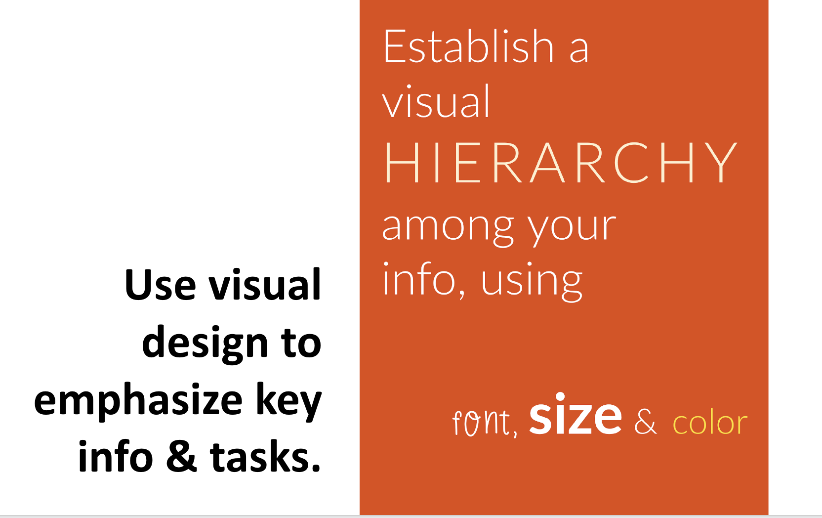
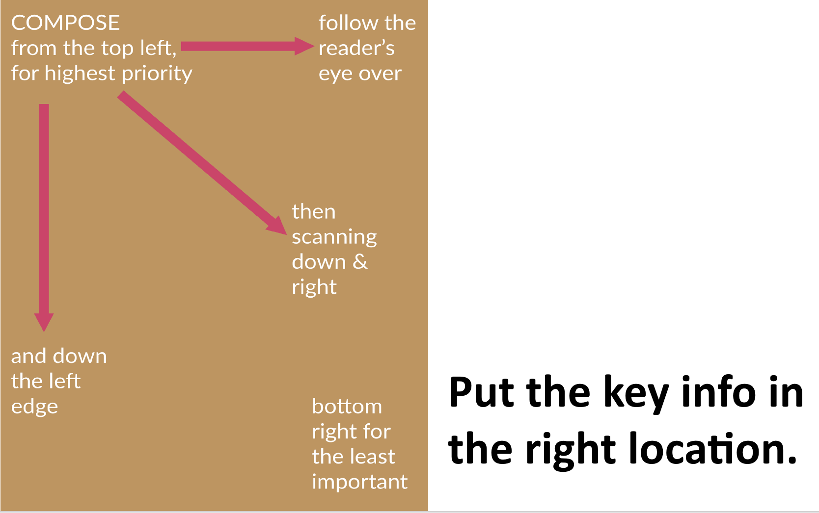
- Have a Clear, Strategic Hierarchy: prioritize the info & tasks, with clear navigation. Define a clear strategy that has a hierarchy — not all info is the same.
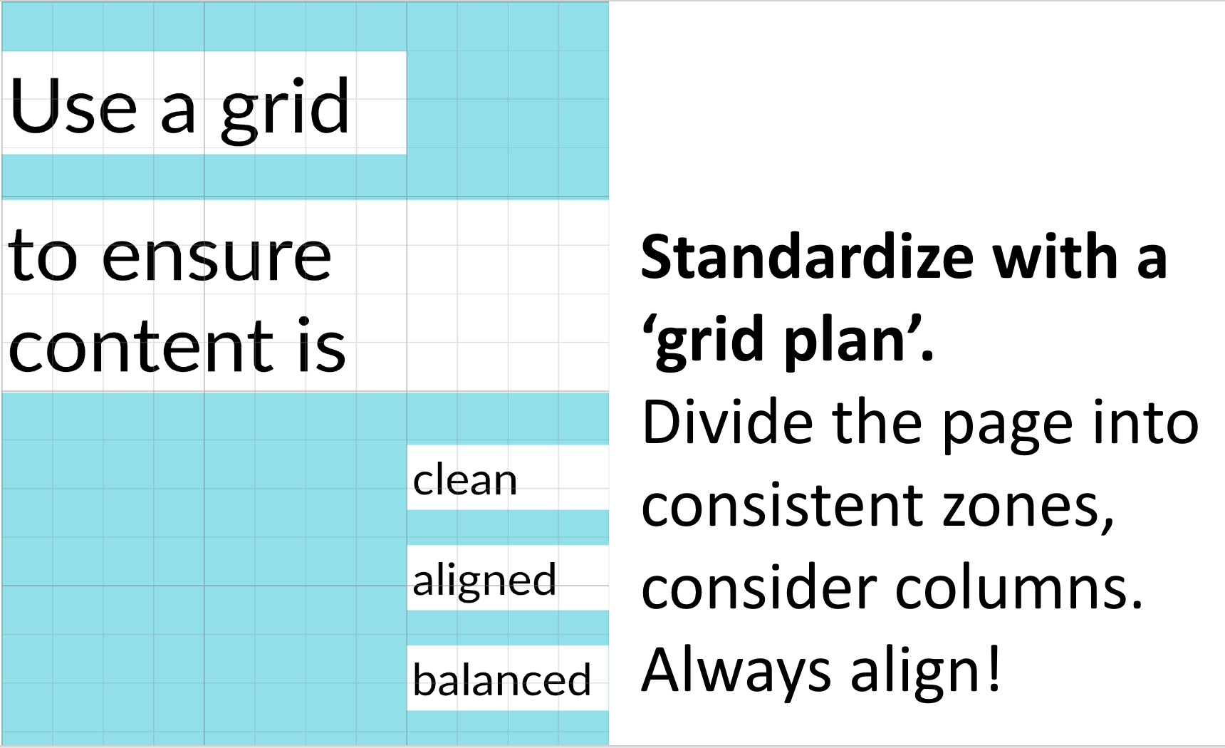
- Provide a Standard, Clear Layout: all content should be aligned, with a single, coherent visual language. Use a grid and possibly column design, to create distinct zones for the person to explore.
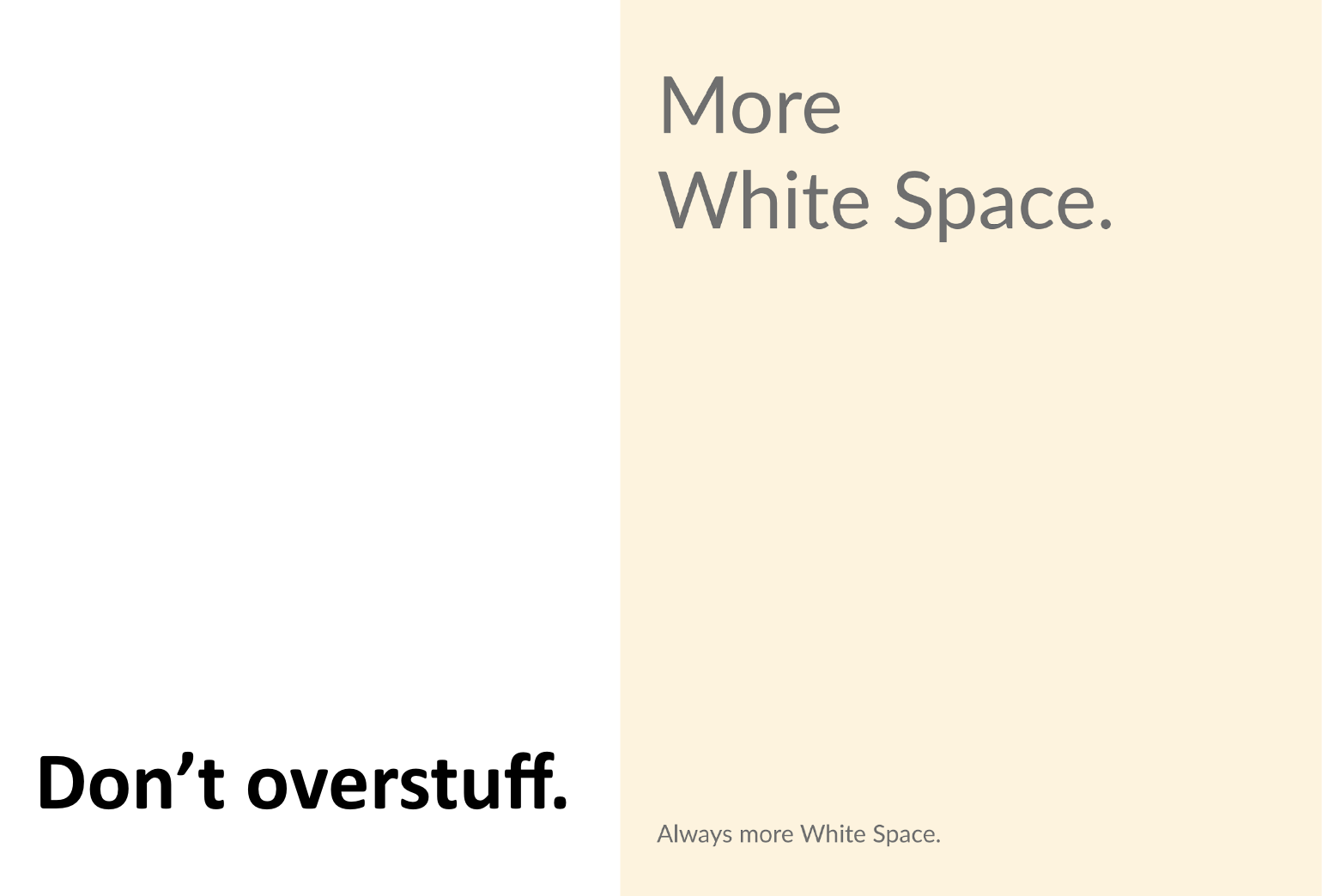
- Give Generous White Space: let the eye breathe, make people calm, and give space to the most important info.
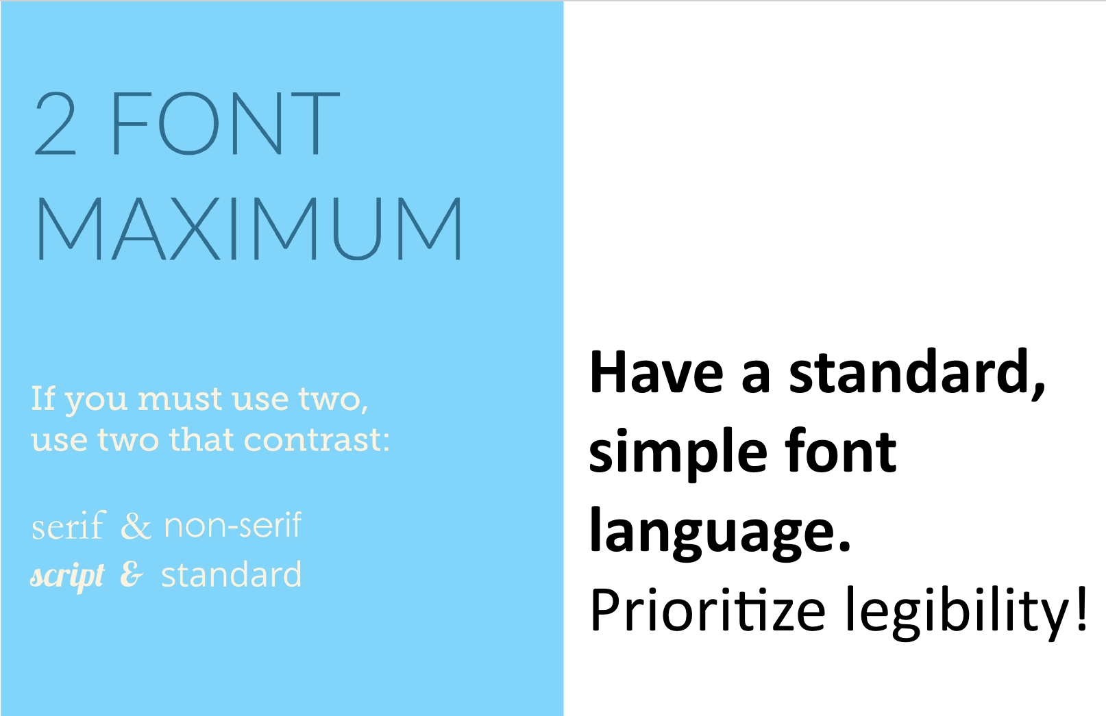
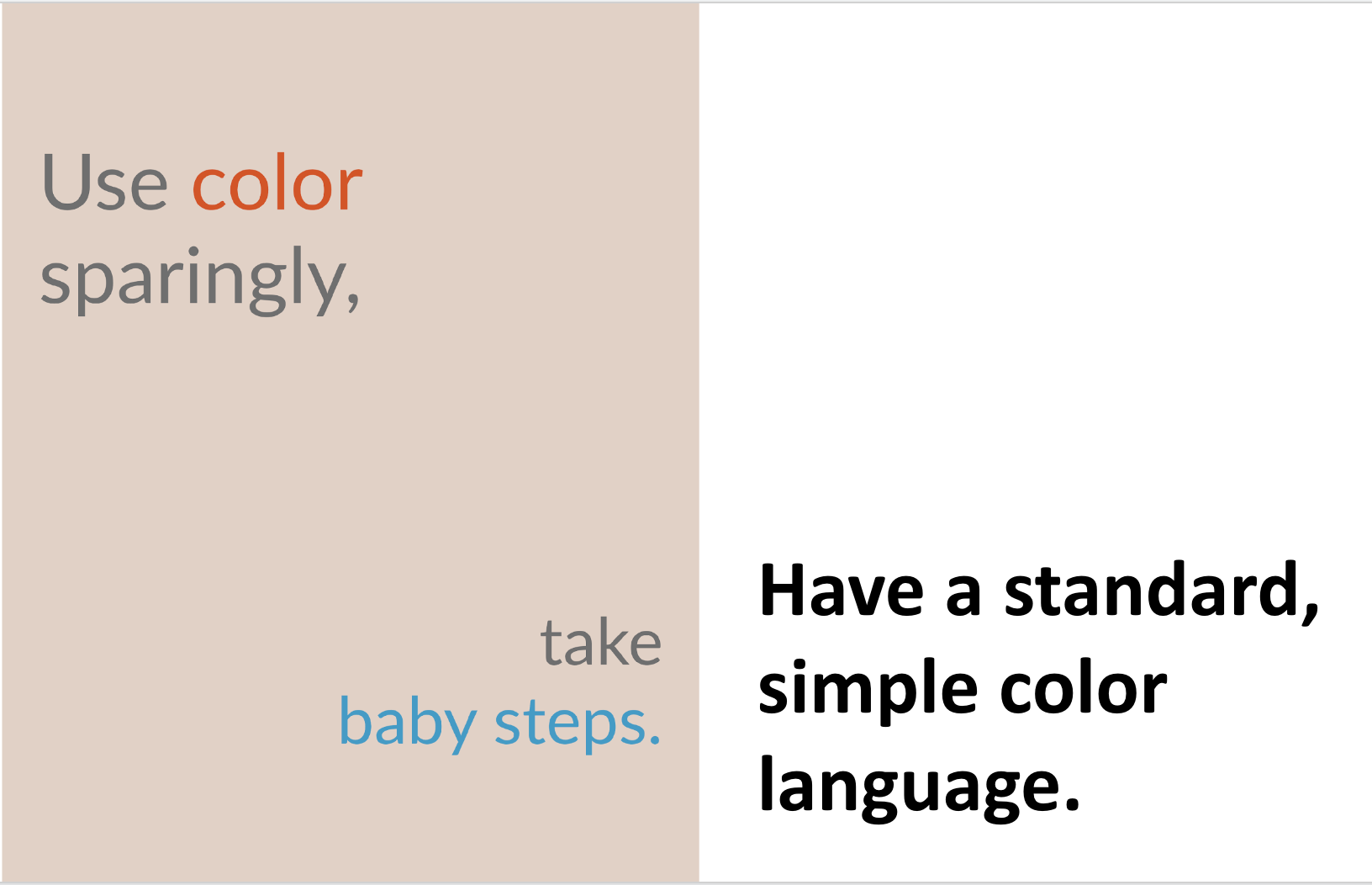
- Deploy Selective Pops: use limited amounts of special fonts or colors to draw attention to high-priority info.
If you want to get more into very detailed communication design choices (like font, color, and accessibility) there are more resources on general visual design rules here:
- The US Govt’s Accessibility for Visual Designers, https://accessibility.digital.gov/visual-design/getting-started/
- Accessible design handbook from Canada https://www.rgd.ca/database/files/library/RGD_AccessAbility_Handbook.pdf
- The US Digital Services (federal level) has a good guide to online accessibility (not just graphic design, but more web design & web forms) https://designsystem.digital.gov/documentation/accessibility/
Court Form Design: the key components of a form
These general principles are great, but they can be hard to translate to the specific world of court forms. We need to dive into the specifics of the court form’s components — and people’s experiences of a form.
Court forms usually contain this shortlist of components. These are the ‘materials’ we can use in our design. We can also track — does the form have all these key things, does it get the hierarchy right, and does it treat them consistently?
- Credentials that signal the form is official for a jurisdiction
- Title and purpose, what the form is & what it’s about
- Instruction info for the user, so they know what to do overall, and then in each section
- Questions and tasks, asking the user for key information and posing choices to them
- Entry fields for the user to put information into
- Insider fields for the court staff to mark notes, enter info
- Links to more help and associated documents
- Next Steps & Deadlines of how to get this form into the court correctly, and what to expect after
Court Form Design: How litigants experience a form
People don’t magically see a form, get excited, and spend the next two hours completing it before they walk it over to the court clerk’s office. Their experience is usually much more complicated and stressful.
We need to see the court form not as a static document, but as an experience. Understanding people’s experience of a form helps us figure out specific principles that can help increase engagement, usability, and usefulness.
From our user testing and observation sessions at the Legal Design Lab, we’ve found trends in how litigants use forms — especially when they are self-represented.
- They scan them over quickly. What should I expect? How long is this going to take? Can I even do this? Am I up for this challenge?
- They do work in bursts. They may have 1 burst when they first engage. But they’ll likely pause & disengage after they get tired. Hopefully they’ll re-engage with later bursts!
- They might get distracted or discouraged when they can’t understand or feel overwhelmed. Can you help make sure this doesn’t lead to disengagement? Instead, support them there.
- They want to be ‘normal’ and strategic. The form should amplify their sense of legal capability — not make them feel lonely or dumb.
This is where we come back to the big goal of access to justice. Court forms could be an essential gateway to participating in the justice system. But they are hard! They ask complex, high-stakes information. And people are often in a high-stress situation, afraid of getting things wrong, and with a lot of other things to do in their life. So if a court form is badly designed, it can disengage users, and shut down their access to justice.
Key Court Form Design Principles
So with that background, I propose a handful of key principles for good court form design.
- Have a clear navigation scheme & glance-able structure. Can a person ‘get’ the key zones of info & tasks within a 1-minute glance-over?
- Be calm & readable. Don’t overcrowd with info and tasks. Does it make the person feel more capable or less? Does it have distinct zones of work
- Support stressed-out users. Does it have off-ramps to info, examples, & assistance — especially near the hardest tasks?
- Be easy to fill in. Have consistent, ample space to fill info in. Make it clear through spacing, boxes, lines about what is ‘right’ and ‘normal’ to put in.
- Don’t prioritize ‘insider’ tasks & info over the user’s. Are user tasks in high-priority places? Are insider tasks put in discrete, low-importance places?
3. Running a Design Process on Your Court Forms
Great! Now we have user-centered metrics to aim for, we’re aiming at more engagement, usability, and usefulness, and we know some principles about how to do this. Let’s think even more concretely. How do we get courts, judicial councils, and forms committees to start improving the design of their court forms? How do we get more people-centered shifts, and more use of key design principles?
Kick off a Redesign by doing a User-Centered Design Review
If you’re inside the court, you can start a design process. I often like to do it in a series of workshops — beginning with design review sessions, involving many different stakeholders and especially court users.
You can lay out existing court forms on a board or a digital whiteboard, and then start going through what works or doesn’t. You can mark it up with post-its, pen, or even cut it up and reorganize.
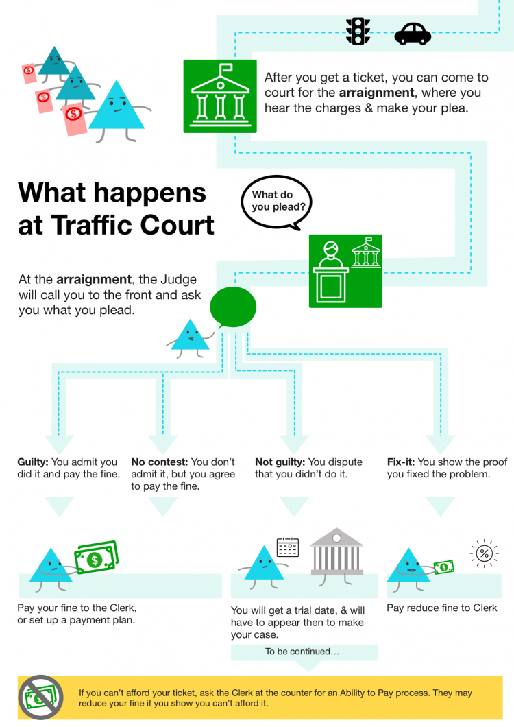
We did this using a Miro board at today’s Form Camp session. We start a design review by beginning with a specific user’s POV. Today, we began with this user scenario:
A tenant in California has just been sued for eviction.
They’ve searched online & found a pdf of this form at the California courts’ webpage. https://www.courts.ca.gov/documents/ud105.pdf
How can we make it usable, useful, and engaging to this litigant?
So we situated our forms discussion in the user’s journey. They’ve come from a Google search, then to a court website, then to a digital pdf. Let’s imagine we are this tenant — and look at the pdf to see what we could improve.

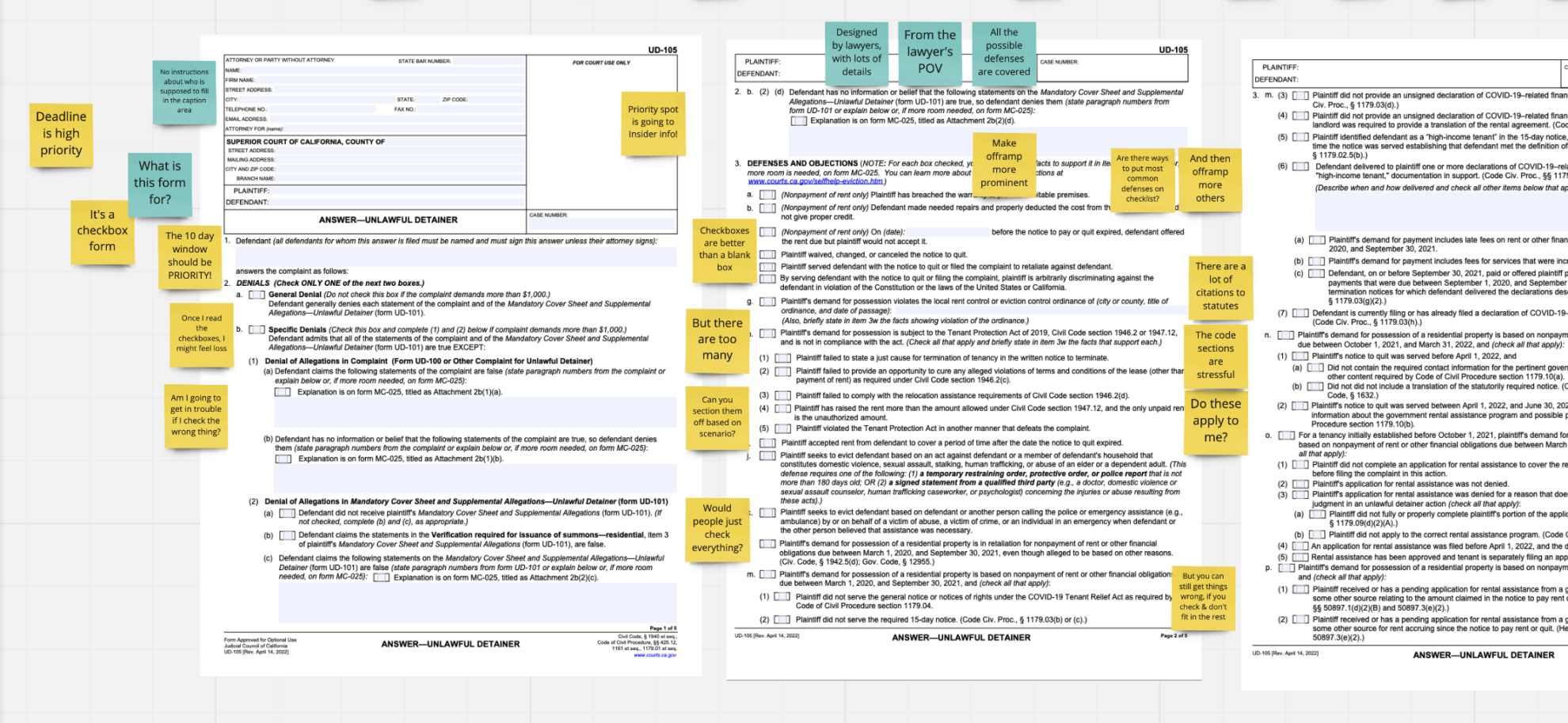
I screenshot the 5 pages of the California unlawful detainer answer response. This is the document that a tenant would have to fill out, in order to defend themselves against an eviction lawsuit. I laid out the 5 pages on the digital whiteboard, and then asked my team to answer a series of questions about how well the form lived up to the key design principles. I took notes with post-its as they gave feedback.

I prepared a series of specific questions, to get the stakeholders to critique the current design based on the court form and visual design principles.
User Journey Review of a court form
If a person sat down with this form, could they navigate it?
- At the start, does the document establish a clear, trustworthy relationship between the court & the user?
- Do the tasks follow a logical, clear order? Are they grouped into clear ‘zones’ that make sense to a user? Are the zones labeled with clear Section Headings? Are there instructions/guidance about sections?
- Are there ‘Offramp’ links for info & more help in the right place — in context where the person might be looking for them?
- At the end, does it make the person confident about the next steps to take?
Hierarchy Review of a court form
Do you have a clear hierarchy of information & tasks?
Your strategic ranking: Have you reviewed everything you want to convey & get from the user? What is most important? What is middle? What is least?
Giving the right treatment: For the most important things, have you put them:
- In the prime locations
- With bigger fonts
- With ‘pop’ of color, font, or bold
Strong headings: Have you put strong, clear headings for the distinct ‘zones’?
Standardized Layout Review of your court form
Do you have standard ways you’re laying out groups of info?
Are things consistently in the same place on the page, in the same font/sizing/alignment:
- Instructions
- Questions
- Entry boxes
- Offramps to More info & links
- Court/clerk ‘insider task boxes’
Are they grouped in clear & distinct zones for a user to navigate?
- Different tasks/topics are clearly delineated from each other
- So a person can ‘take a break’ in-between zones
Legibility & Capability-building review
Are the zones, text, and layout all accessible & enhancing legal capability — instead of overwhelming the person?
- Is there plain language or legal jargon, code references, etc?
- Is the text presented in a large enough font, with enough line spacing, for it to be easy to read?
- Does the text go all the way across the page (too long)?
- Are the different zones of tasks cluttered together on page? Or is there breathing, white space at margins and between zones?
These different sets of questions can make sure the stakeholders are doing a critique based on the user’s POV and design principles derived from past best practices. If you don’t use these questions, it’s easy to start shifting back to an institutional-centered POV.
After design review workshops, the team can then move onto other kinds of workshops to generate prototypes, test them, and decide on final versions of forms.


Better Court Form Design will be a continual process
It would be great if I could publish a template for all court forms to follow. It might have hard rules about maximum page length, the ideal font size, and the perfect grid layout. Perhaps these patterns will emerge in the coming years, as we do more testing of form designs with a wide range of users.
But for now, the best way to make user-friendly court forms is to have a continual process of reviewing current forms with community members, drawing on established design principles, testing any new prototype with litigants and court staff, and using our people-centered indicators as the metrics to determine if a court form should be released to the public.
In any court form design, there will be lots of trade-offs. How many details, claims, defenses, and rights can we let a person know about — before we exhaust them to the point of disengagement? How much generous white space can we give a person, until the form becomes so lengthy that it turns them off?
That’s why a multi-stakeholder process, still rooted in the litigant’s (and staff members’) points of view is necessary to decide what works best in making these trade-offs. Ideally, more courts will be engaging in this design work, gathering even more principles and best practices, and leading towards more standardization of the best form designs.
That said — perhaps this whole conversation will be moot soon, if we move towards more interactive form-filling websites, with no more PDFs at all. We’ll then move on to the best design of software interfaces. There will be slightly different principles in play — but our metrics and goals should still be the same.
We want more people to be able to protect their rights in court, and do so with a sense of confidence, capability, and dignity. Good court forms are fundamental to good access to justice. As more courts embrace user-centered design, we can start moving to this better future.