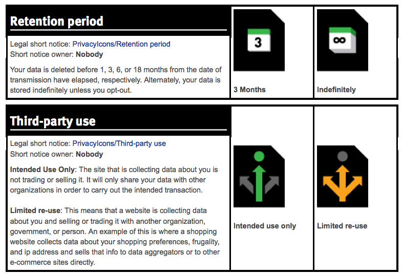
For an ongoing study our team at Legal Design Lab is working on, to measure the effectiveness and engagement of different types of privacy communications, I have been hard at work making rough first versions of privacy concepts as icons and pictograms. It grows out of last summer’s GDPR visualization workshop.
Please give feedback — I know they are not all clear or ready for primetime yet, but putting them out there for some feedback in the meantime.


![]()


1 Comment
I’m pretty new to these kinds of icons so I may be missing something more intrinsic to this type of icon, but I don’t find these very intuitive. I’m guessing that the person silhouette on the folder means there is personal info in the files. The cupped hand underneath vs. hand in the top left corner are only sort of distinguishable in comparison to each other. Even then I sort of think the cupped hand means keep private, but that is especially unclear. The hand in the top left corner probably means OK to distribute, but is not super clear either, especially when the black hand near the close window X also seems to mean do not share on social media. These sort of icons also sort of need to make their way into wide use before they become at all clear. Just looking at the power icon on most electronics it’s difficult to imagine why that is an open circle with a line in it, although I’m sure there’s a reason.