In our current class at Stanford Law School, Exploding the Fine Print, we are taking a design-driven approach to reimagine how to communicate risks, fees, conditions, rights, and other details to laypeople. Typically these are communicated via ‘fine print’ — long swaths of text paragraphs, in which all these matters are written about.
What are better ways to do this, beyond just paragraphs of text? How can we get people to actually pay attention to them, read them, and use them as they make decisions?
This quarter, we’re taking on this question in regards to disclosures that accompany financial products that people could purchase in order to invest their money. We’re working with the US financial regulator FINRA, to help them understand and rethink what is possible and what is effective when it comes to disclosure requirements for financial brokers, as these brokers advertise their products and create websites and apps describing them.
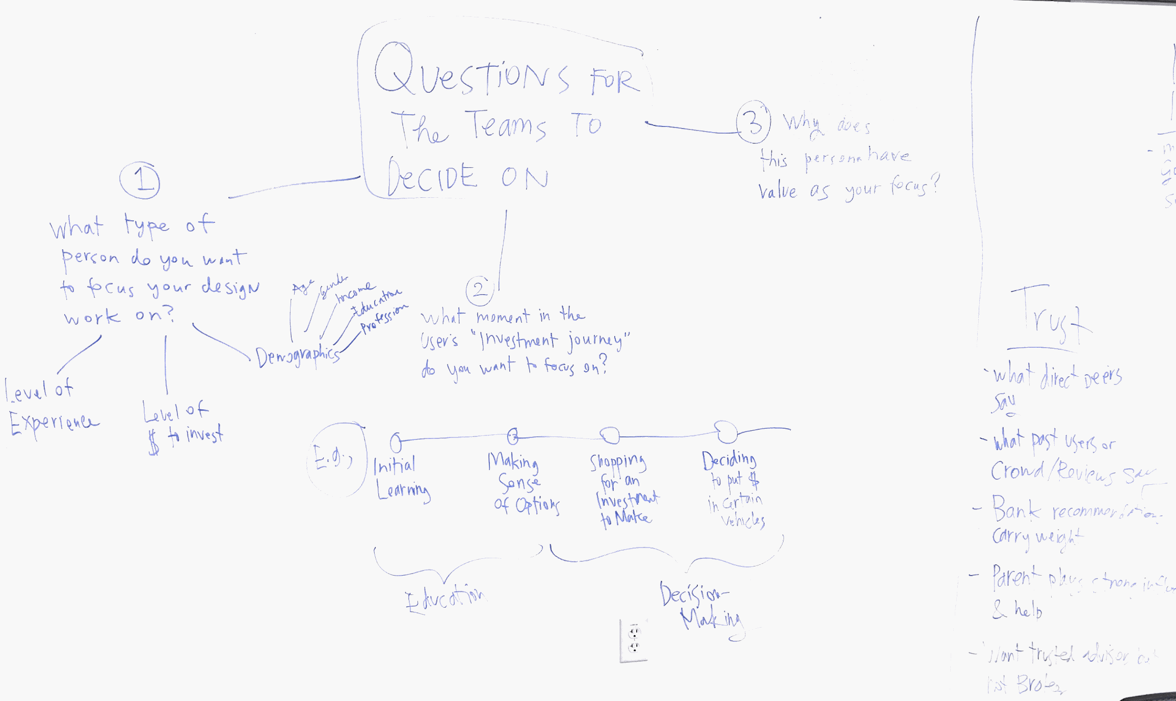
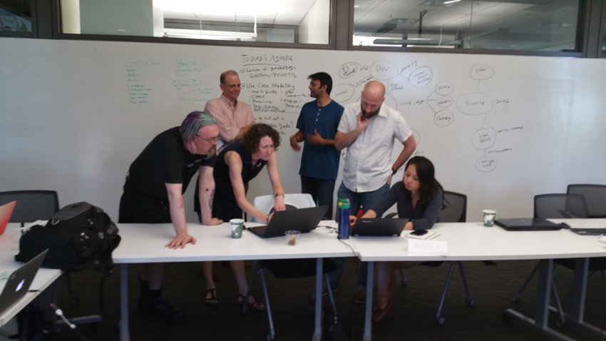
We’re halfway through the quarter, and we have done some focus group with our target population — millenials who are just starting out on their investment journey. Here are some of the whiteboards with our debrief from the focus group interviews, that highlight some of our initial findings. We’ll write these up more thoroughly in future posts.


Some of these findings:
- Millenials (at least those we spoke to) reach out to Google and app stores to seek out trustworthy sources of advice about how to invest, and to actually invest as well. Some of these apps include Acorns and Robin Hood.
- They tend not to trust ads, but instead rely on their own Internet searching skills to try to collect as much information as possible, sift through it, and devise a strategy.
- They do not read fine print disclosures and likely will not ever — even if these disclosures are given a ‘visual facelift’ with more structure, icons, or table/matrix presentation. They think this is for regulators, not for normal people — and so don’t bother tuning into it.
- They don’t want too many shortcuts. Actually they want more information, and to geek out about options and consequences — but they don’t want to do it by reading seemingly legalistic fine print details. They want to gather info from third party sources, hear may different voices, watch videos, read blogs, and do their own research to figure out what they trust and believe.
These results coincide with my previous research about how people use the Internet to deal with legal problems and devise strategies. Even if they feel very little confidence in their knowledge of the subject matter, they have strong confidence in their ability to use the Internet. This leads to a spirit of self-help through Googling, and a distrust of any thing that is too packaged, that seems tied to a commercial actor trying to profit from them, and a willingness to trust their own research.
After this initial user research, then the groups all had to decide what exact framing of the ‘better legal communication design’ challenge they would choose. What exact type of millenial user, at what point in their investment process, would they decide to focus on for their design work?
Another blog post is soon to come with more detail on those focused design briefs.

1 Comment
[…] Sourced through Scoop.it from: http://www.legaltechdesign.com […]