Initial Concepts
We used rapid prototyping and testing to craft new concepts for disclosure design.
After creating design briefs, the teams brainstormed new ways to accomplish the challenges defined in them. The students were encouraged to think beyond the traditional disclosure method of providing paragraphs of legal text, to consider new ways to communicate the contents of the disclosure and to make it meaningful to the end-user. With this ambit, several of the groups proposed concepts that departed from the disclosure itself — instead finding it potentially more meaningful to support wise decision-making and understanding of crucial terms about investments through different means.
One group, in Cluster 3 of the ideas listed below, focused more directly on revising status quo disclosures, while the other groups prioritized other kinds of experiences and communications as more meaningful for giving the user necessary foundations to make sense of financial decision-makings and appreciate the importance of disclosures. Their driving assumption was: no matter how well-designed a disclosure is, if the user has not been equipped with the knowledge of the domain, the regulator, and the possible risks around bad decisions, then it will not truly serve its purpose of protecting the user.
Cluster 1: Improving FINRA’s outreach to and education of consumers
- An online FINRA-sponsored self-profiling questionnaire to help a user define their own investment preferences, by answering a quick series of questions that would then diagnose for the user what they should pay attention to, and how they should go about decision-making as they embarked on financial investment
- General online and print material FINRA branding campaign, to indicate what its role is, and to encourage consumers to engage with its resources, as well as the disclosures it requires of financial companies. It can leverage its 3rd party neutral status to build a relationship as a trusted advisor to millennials.
- FINRA on-campus outreach, in which the regulator would attempt to build a stronger brand, to raise awareness among college-aged and graduate student-aged millennials, about the importance of being financially savvy and how to make smart financial decisions
- In addition to this campaign, the launch of an online FINRA-sponsored, user-focused question forum, that would let lay people pose questions about financial investments, terms, risks, fees, and other considerations about how to act wisely while investing. The answers could be provided by other users (peers), representatives of companies and third parties, and from FINRA staff as well.
- FINRA grading scale, that would rank products on a scale based on the terms they offer the user, so that users can easily measure products against each other, using the metrics offered by a trusted neutral third-party regulator.
Cluster 2: Preparing millennial consumers to make wise financial investments, through social experiences and simulations
- A financial investment game app, that would let a person mock-invest in different products and see the outcomes that result. It would allow for role-playing and simulation to give the person test-runs with strategies, and the ability to have ‘do-overs’, in which they can learn how to be more discerning about terms and conditions, as well as more definite about what their own risk tolerance and preferred outcomes are. The simulation could possibly morph into a real investing experience, if the user wanted to go from ‘practice’ mode to ‘real’ mode.
- Social group investing, in the form of an online-facilitated network with people you know and trust in real life, to share explicitly and deliberately how you choose what to invest in, and to track outcomes with friends — at first fictionally, then for real.
- In-person meet-ups among interested millennials, considering how to be more financially savvy and embark on investing, that introduce key concepts and disclosure content, but in a social and conversational setting. The education and decision-making support are introduced in-person, through both subject matter experts (from trusted institutions) and reinforced through peer-to-peer conversations.
Cluster 3: Improved presentation of terms of financial investments, targeted at preferences of millennial consumers
- Use of visual cues in disclosures that flag that disclosure content is important, approachable, and consumer-directed, with more imagery, bolder fonts, more prominent placement — drawing from styles that are already popular with millennials in other publications, advertisements, and web content to show that the disclosures matter and “are for you.”
- An interactive tool that let a user express what their concerns and preferences are around financial investments, and then respond with suggestions about (a) what parts of the disclosure the user should focus on, giving them a prioritized and summarized set of points tailored to them, or (b) what investment products fit their situation, with explanation including the disclosure materials to help them understand why the terms of this product are best for them.
- Socially-flagged disclosures, which take the typical disclosure text or graphs, and then mark them up with notes about what other users find useful, and what takeaways others learn from them — in effect training the user about how how read the disclosure and make sense of its contents.
- Required friction with disclosure content, that again takes the standard disclosure text, but now requires that users click consent to individual clauses, or must click through a staged version of the disclosure that is shown message-by-message rather than all at once. Another type of friction would be a quiz about the disclosure content that a user would have to pass before they would be allowed to make a decision.
These were the ideas that emerged out of the initial brainstorm, which the groups considered both breakthrough and viable. The point of this crop of ideas was not to create the perfect concept, but rather to test our hypotheses about what the target user would engage with, and what subject matter experts thought could actually be implemented to some success.
Evaluation of Initial Proposed Redesigns
Target users gave mixed reviews to the concepts. The class did on-the-street testing, presenting the ideas to approximately 30 people who fit the target user description. Each of the respondents were shown ‘concept posters’ of individual designs, with a title, illustration, and short description conveying the basics of the proposal. They were then asked to give critical feedback, specifically in regards to whether the proposal would engage them (get them to use it), increase their comprehension (help them understand how to wisely make financial investments), and to help them follow-through on this wise decision-making. The themes of the user responses are as follows.
Avoid over-complicated or demanding initiatives
A general reaction was that any concept that would take a large amount of time or a large deviation from their current practices would not work for them. In this category were FINRA on-campus outreach, or in-person meet-ups around financial decision-making. There was resistance to these ideas as too demanding, mainly because they required in-person interactions, and without enough benefit to be attractive. Some users did express that they would appreciate the chance to speak with a neutral party face-to-face, but this was not the majority view.
Ignorance of/Disinterest in FINRA
Additionally, there was very low awareness of FINRA as a body, or its basic purpose. This meant that concepts centered on FINRA did not resonate with the users, because they did not know enough about the agency to want to learn more about it. Increased branding or outreach efforts did not excite the target users, because they did not see the value to them. When FINRA was explained to them, they did not clearly understand its role, because it was not clearly a government agency, so there were some questions about who FINRA represented.
Social holds promise
Social group investing was also seen as potentially too demanding of time and attention, but there was potentially more value in it, if it was relatively easy to bring the network together and if there was some added bonus apparent from operating in the group. The concept of having more social input and sharing of knowledge around smart decision-making tested well, whether it meant investing together, or as from Cluster 3, learning about how others have made decisions and what information has been useful to them. Respondents found value in hearing how people in their direct network, as well as a larger crowd, behave and weigh options. If social decision-making was quite easy to join into, they would have an appetite to try it out among their friends, roommates, or other relatively close network. Social cues around the disclosures would also engage them. They would look at the terms and factors that others have found most meaningful in order to gauge what is ‘normal’ to do when interacting with disclosures, as well as a shortcut to make use of the disclosures in a more efficient way.
Tell me more about me
The ideas of a self-profiling questionnaire or a financial investment game app tested better. Respondents felt there would be some benefit they would derive in learning about what type of investor they should be, and knowing more about how different choices might play out for them. These tools would allow for self-reflection and were oriented more around self-development, which made them attractive to the target users.
Less is More, but still give me oversight to know I’m covered
Users appreciated the designs in Cluster 3 that reduced the amount of text they would be confronted with initially, though they still wanted the chance to dig into more details in case so that they would know the short recap was based on something more substantial. They also expressed an interest to know that they “are covered” — meaning that they are not missing key information — while also not having to consume too much information. They want a simple experience, but one that is still comprehensive enough that they are assured they don’t have large blind spots while entering into decision-making. This leads to the insight that there needs to be a fairly dramatic paring down of the status quo style of text disclosure of every single term and condition, but not to a single grade or other radically simple summary. A successful “less is more” approach would still give the user oversight of the key categories of disclosure content, and the main points to know within these key categories — but not over-disclosing with too many details or with categories that do not in fact contribute to good decision-making.
Interactive and visual disclosures would be better, but still I don’t want to read disclosures
The concepts in Cluster 3, which give visual facelifts to the current text disclosures or provide some more interactive searching and comparison, tested generally well. Respondents said they still might not engage with them, because they are not always in the mood to ‘read the fine print’. If they were offered by a neutral third party, or were more clearly presented as something giving obvious value to the user, then this increases the chance of engagement. One large value of the more visual design approach is that it would help people overcome their lack of confidence in being able to navigate the disclosures. One user responded “I’d like to see pop-outs that put terms and fee information into graphical representation… I understand a lot of the differences but still feel nervous that I’m missing some hidden things.”
Smart, interactive tools that would let a user easily compare the terms contained in one product’s disclosure with a similar product’s was considered quite valuable. It resonated as something familiar to other shopping and planning comparison tools, like on Google Shopping or on Kayak. Visual additions to the disclosure, or a more systematic layout of the disclosure in a table, might increase the respondent’s likelihood to pay attention to it, but still suffered from the fact that it seemed like ‘fine print’ that could be extra details, beyond what the user wanted to engage with. Forced engagement with a disclosure, like through more click-throughs or a mandatory quiz, received poor responses, because it seemed like forcing unwanted content on the user.
Stay within the Regulator’s ambit, with improvements on the traditional disclosure
Feedback from subject matter experts was also helpful in prioritizing what types of designs would be most viable, from both the regulator and the financial company’s perspective. The ideas in Cluster 3, around improving the visual design and interactivity of traditional disclosures were the most warmly received. There was interest in ‘tiering’ information, so that it was staged into more discrete sections, and that would allow for more modular engagement — a user could dive deep into the details which she cared about, and avoid details that concern matters of less priority. There was also interest in integrating lightweight visuals, and cleaner visual designs that allowed for more white space, more readable fonts, and greater hierarchy. These ideas fell more directly into the established notion of how to communicate disclosure content to lay people, and so were judged to be more likely to be put into effect as suggestions from regulators or new designs from companies.
The proposals that involved the production of new apps, social events, group investing, or educational campaigns were sidelined, as too far afield from FINRA’s ambit. Even if there is value to user, it did not seem to be in the ambit of the regulator to launch initiatives that were not directly related to disclosure through text, graphics, or a web tool. Some experts suggested that other companies or nonprofits might want to explore those more social or educational initiatives, rather than regulators.
The experts also gave negative feedback to any proposal that would involve FINRA evaluating financial products or monitoring investors’ communications. The notion of a regulator sponsoring a grading scale for users was considered non-viable, because it would involve an entirely different regulatory paradigm. Even if users want this type of straightforward assessment from a neutral, consumer-centered third-party, the experts gave the feedback that FINRA is not in the position to play this role.
Revised Concept Design Proposals
Based on the feedback from target users and subject matter experts, each of the three groups worked to either improve the ideas they had earlier proposed (if they had received positive responses during testing) or to pivot to new concepts that fit more closely with the feedback gathered during the testing. These revised concept designs were fleshed out in greater detail, and were presented during the class’s final review session, for further comment from our class partners.
These proposals still are early-stage prototypes, consisting of envisionment sketches and short descriptions. If there is interest in implementation of pilots of any of them, then the next step would be to develop functional versions of the concepts, in the form of ‘minimum viable products’ that could be deployed in the field and used to gather empirical results about engagement, comprehension, and follow-through by users.
The Preference Matcher

This tool is a web application that would let a person enter in their preferences in standard categories. They would choose from small, controlled menus about fees, risk tolerance, timeline, goals, etc.
The tool would process this information to deliver back two categories of content:
1) A set of commandments this person should use when making financial investments, personalized to their chosen preferences. This will help the person understand what their shortlist of factors are, that they should look for when choosing products and evaluating their conditions.
2) A set of investment options that may fit these preferences. If this app is hosted on a third-party site, then it can present a range of appropriate options from many different companies. If it is hosted on a company site, it can be products offered from this one company.
The Strategy Calculator/Scenario Spinner

This interactive web/mobile application would provide customized guidance to a user. Ideally, it would be created and hosted by a third-party, neutral organization. A user would visit it when they are weighing and crafting a strategy for their finances.
The tool would ask them to enter in a small amount of variables: inputs about the financial products they are considering, the kinds of money they would be investing, and the goals they have (for example). As the user enters in these variables, it immediately displays what kinds of outcomes the user can expect. It would show relevant fees, terms, conditions, restrictions, and flags that the user should know about — if they were to pursue this path.
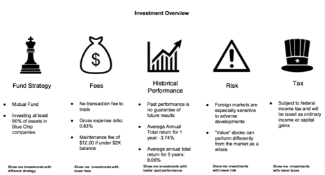
The Investicons/Table-Based Disclosures

This is a visual redesign of the traditional disclosure. It categorizes the information into distinct columns, and marks them with clear headers and pictograms to make them more comprehensible and approachable.
In addition, the disclosures are summarized into digestible summaries, and paired with choices for the user to take. If the user wants more information, they can click on the links within the matrix to see the full legal wording.
The column-layout allows users to jump more quickly to parts of the disclosure that matters the most.
The design principle at work is ‘addition by subtraction’ — by cutting information out, and providing more white space, the user is given more quality information that is easier to engage with.
The investicons could also be used apart from the official ‘disclosure communication’, and integrated into advertisements and anywhere else some disclosure must occur. The use of the same visuals will allow more literacy and engagement with the disclosures.
The Comparator Tool


This tool would allow users to compare investment opportunities based on their core factors (including those included in the disclosures). The options could be pulled from one company or many. Ideally, this tool would allow users to search based on the factors they value, and then surface the best option based on the search.
The comparator tool could also be created and hosted by third parties (non-regulators, and non-financial services companies) who have access to standardized data about the financial investment options and disclosures, and use this to provide a comparator tool to consumers.
Social Signalling

Integrate social messages into the disclosure, that communicate to the reader what other users find valuable, what concerns them, and what is ‘normal’ around the disclosures. This could be done with visual markers, pop-ups, or annotations.
These different indicators would provide social hotspots on top of the standard disclosure, to give users more of the social feel that they value, and more information about what the ‘crowd’ is doing and what it values. It would tap into users’ interest in crowd-wisdom and give them a desired sense of what ‘most people’ care about and think through disclosures.
The Smoking Warning Label
This design provides a very short and blunt advisory that tells users that they should pay attention to the content. Its message is that they could face negative consequences if they don’t understand and use the information.

These labels can give priority to the more consequential disclosures. They can be big-flag warnings, that visually shout at the user “This Could Potentially Harm You, Pay Attention!”.
Online, the label could pop-out. It could require a click-through to move past it. In print, it could take a defined amount of real-estate on the page.
The Nutrition Label: online or in print

This concept provides a standardized layout for all of the items being disclosed. The composition is organized with headings and standard locations for each item. Across any product, the same information type will be in the same place. The disclosures are standardized across the industry, and the composition features more categorization and summaries that help the user get a snapshot more easily.
Online, either on a mobile phone or on a desktop, the nutrition label could be presented through a button/dialog box that explicitly asks the user to question “Is this right for you?” or “What should you know before you choose this?” Then, upon click of this dialog, the user would see the standardized layout of categorized disclosure terms.

Similar to the online version above, the print version of a disclosure nutrition label would have a standardized set of icons and layout for all disclosure terms.
This would take a substantial section of the advertisement’s real estate, in font-size that would be 12pt or above, and with visual icons that would draw users’ attention to the terms. The terms would not be presented as ‘footnotes’ or ‘fine print’, but rather as a central part of the overall communication, presenting the key points (and not all points) about the terms and conditions of this financial product.