A Beginner’s Guide to Wireframing from Webdesigntuts+.
Here is an excellent step-by-step tutorial on how to wireframe out a website or app you want to develop! Go from sketch to proper design with this guide.
Wireframing is an important step in any screen design process. It primarily allows you to define the information hierarchy of your design, making it easier for you to plan the layout according to how you want your user to process the information. If you’ve yet to use wireframing, it’s time to get your feet wet..
It’s like an architectural blueprint; you need to see it in two-dimensional black and white diagrams before you understand how to build the actual house. Similarly for a screen design, you can’t start building pixel layers in photoshop, or writing blocks of code, without knowing where the information is going to go.
At a deeper level, a wireframe is also very useful in determining how the user interacts with the interface. For example, wireframes can contain various states of button or menu behaviors.
Wireframing is important because it allows the designer to plan the layout and interaction of an interface without being distracted by colors, typeface choices or even copy. I like to explain to my clients that if a user cannot figure out where to go on a black and white wireframe, it doesn’t matter what colors you eventually use. A button has to be obvious even if it’s not shiny or brightly colored.
Like the foundation of a building, it has to be fundamentally strong before you decide whether to give it an expensive coat of paint.
Step 1: Getting Inspiration
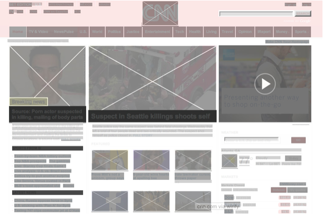
Before getting into further details, since a picture can paint thousand words, take a look at I ♥ wirefames. You’ll be able to get a quick overview and visual understanding of how other designers are handling their wireframing process.
Perhaps also grab this nifty browser bookmarklet, Wirify which enables you to see a “wireframe-d” version of any live site.
If you continually observe what other designers or sites are doing for their wireframes, you will slowly get a picture in your mind of how a wireframe helps to organize information for the screen.
Step 2: Designing Your Process
Design is an organic process and thus different designers approach wireframing and its translation to visuals or code in different ways. You have to find the process that brings out your own strengths and you are most comfortable with. Below is a diagram showing several typical processes:
37signals is well known for advocating the use of sketches and going straight to code, though it seems some of their designers do involve visual mockups in their process too.
For me, I have gone through enough design-to-code cycles to have a somewhat streamlined process. This is a step some people may not think about, but I also consider any html/css framework that I would use in the project.
For example, I used to build a ton of sites in Blueprint, thus I would set both my wireframes and Blueprint to the same 12-column grid. This speeds up prototyping and development time considerably, as instead of having to write every element’s width into my css stylesheet, they are now pre-defined from one to twelve columns wide. I now use cssgrid instead for its responsive design support, but it is still set to a 12-column grid which you can download as a photoshop template.
As I’ve said, it’s up to you to decide which process you are comfortable with, sometimes you may have try it out several times before realizing which is the most effective process. Some people may be really good at sketching and they may prefer not to use a wireframing tool at all. Other designers may want to have as many steps as possible to minimize deviations or allow them to think through every single iteration as the design starts to take form and shape.
You’ll eventually develop your own preferred process but for the tutorial’s sake I’ll use my typical process as an example:
The reason why I use usually Illustrator as my wireframing tool is mainly for three reasons:
- Styles – you can save type and object styles and re-use them throughout, just like CSS.
- It’s easy to modify, move or scale multiple objects.
- It affords easy transition to Photoshop later.
However, I do use other tools and it depends on the project scenario. I will briefly outline some popular tools, their strengths and their weaknesses in the next section.
Step 3: Pick Your Tools
Here are some popular tools in no particular order:
Balsamiq
Balsamiq became popular as wireframes produced with Balsamiq resemble sketches, making it immediately obvious that the wireframe is not a finished product but a work in progress. Balsamiq also has a huge library of reusable components which you can drag and drop very easily to design your wireframes.
You can also use it on almost any platform, with desktop versions available for Mac, Windows and Linux, plus there is a web version if you prefer to work in the cloud. Third party apps like iMockups for the iOS also support Balsamiq export formats.
Omnigraffle
An old Mac favorite, Omnigraffle also has a widely supported user-contributed library of reusable components; Graffletopia.
Since it was developed specifically as a diagramming application, Omnigraffle also has complex features like automatic layout, custom object styles support, smart guides and graph tools. Some of these features are also available in the Adobe CS suite, but if you do not have the CS suite, Omnigraffle is good value (~$100) for producing detailed wireframes.
Axure
Almost like the grandfather of wireframing tools, Axure was one of the first professional-class wireframing/prototyping tools. Until recently, it was only available on Windows. I personally don’t have much experience with it, but it’s known to be a widely-used tool among industry professionals.
Flairbuilder
A new kid on the block, Flairbuilder has very strong support for interactions.
It also has a huge component library, supports master pages and you can export the prototype to be viewed online.
Online applications
If desktop software is not your cup of tea, there are tools like mockflow, hotgloo and mockingbird.
Keynote/Powerpoint
Keynotopia “transforms your favorite presentation application into the best rapid prototyping tool for creating mobile, web and desktop app mockups”. For non-mac users, do not fret, Keynotopia also offers powerpoint templates.
I personally highly recommend it if you need to wireframe or protoype mobile applications quickly. Another good alternative is Keynote Kungfu.
Adobe CS
For those already familiar with the Adobe suite, Fireworks, Illustrator and Indesign are very capable wireframing tools with their own individual strengths and weaknesses.
Fireworks
You can work on the entire design process in Fireworks, from basic wireframes to the full visual. Fireworks support master pages (think of them as reusable templates where every edit on the master template can be applied throughout your childpages), element libraries and you can make interactive prototypes with Fireworks relatively quickly.
Illustrator
This is one of my favorite tools to use because I am already very familiar with Illustrator and I am sure many designers here would be familiar with it too. I use Illustrator when I am trying to do quick, but complex wireframes, with no need for interactivity.
What makes it a winner? The ability to export as a PSD with editable layers, strong copy and paste support to Photoshop, and strong typography controls with type styles you can save, edit and reuse, almost like CSS.
Indesign
Similar strengths to Illustrator with even stronger typographic styles controls, strong master pages support and the recent ability to make interactive prototypes.
I pick Indesign when I have to make interactive high fidelity multi-page prototypes. The only caveat for me is the weak export support to Photoshop for designing visuals.
ProtoShare
“Powerful Prototyping Made Easy.” Recently released version 9 with a new wysiwyg palette. Worth checking out.
Step 4: Setting a Grid
There’s a lot of theory with regards to grid systems, but without going too much into it, I shall explain it as “a structured and simple way to layout elements”.
I’m using Illustrator for this tutorial but the steps can be applied to any of your tools.
Firstly, set a document size. I used 1280 x 900 because I will be using cssgrid which will allow my website to scale between mobile resolutions to a maximum of 1140 pixels easily.
Place the downloaded template from cssgrid into your document.
Tip:
There are plenty of grid templates available for download, but if you’re interested in customizing your own take a look at responsify.it.
Step 5: Determine Layout With Boxes
Start by drawing boxes on the grid. Think about the order of information you would like to present to your visitors, top to bottom is the easiest, followed by left to right. Below is an example of a wireframe which has a layout commonly used by software companies these days:
Sometimes, depending on your objective and the entity you are designing for, you can be creative with the layout, though still keeping the hierarchy of the information in mind. This is a real-world example of one of my clients where I was breaking out from conventional technology company website layouts:
Here’s a layout for a blog, with carefully positioned advertising containers and specific instructions for the client:
Step 6: Define Information Hierarchy With Typography
After you are satisfied with how the boxes are laid out, start dropping in bits and pieces of your content to get a feel of whether the information is being well-structured. The rule of thumb is the same: the information you want to deliver to your audience has to be clear, even in a black and white wireframe.
Simply using different font sizes as a start is a great way to differentiate between the different levels of information.
Don’t be afraid to experiment at this stage. Sometimes, as you fill in more detail, you may realize the original layout is not working well. That’s the whole point of the wireframing process; to make as many iterations as possible in order to narrow down the best way of representing the information you are trying to communicate.
In the example below, I have decided I wanted the screenshots to have more impact and I have also started to use black boxes to define which are the areas that would take visual importance for this website:
Step 7: Fine-tuning With Grayscale
Using the full spectrum of grayscale can help you determine the visual strength of your elements without having to pick a color palette. In fact, it may help you during the visual design process later on.
Step 8: Hi-definition Wireframe
This is an optional step, but if you like to take things in increments you may want to try it out. Making a wireframe high definition means simply adding more details, as much as possible, without going too granular into the visual details. It may mean filling in the actual copy into the wireframe and trying to determine the ideal font-sizes:
It could also involve colors:
The general idea is that at visual/code stage you want to be in polishing mode and no longer in drafting or experimenting mode. Perform the iteration cycles (feedback <-> wireframing) as quickly as possible in a wireframing application you are comfortable using, rather than moving layers and pixels in photoshop.
That being said, in certain scenarios it may be more ideal to skip defining the details too much and go straight into an interactive prototyping stage (ala 37signals). The argument for this is that certain interaction details cannot be communicated fully on a flat image.
If you work with a team of developers, you may want to hand off the approved wireframes to the developers for coding the basic framework while you work on the visual.
Step 9: Translating a Wireframe into a Visual
Mentioned earlier, the reason why I tend to prefer using Illustrator for wireframing is because I can export it into a .psd with most of the type layers editable. By the time I am in Photoshop I won’t need to edit the type that much (Photoshop has inferior type control tools, though much improved in CS6):
Here is an example of a wireframe translated into a visual. The backbone of the wireframe is pretty much intact, though there are tweaks made visually. You can also view this website live:


Conclusion
So here we end this tutorial. I hope it’s inspired you to start experimenting! As with any design process, do not be afraid to iterate, iterate and iterate.
Also, do spend some time experimenting with different tools and processes. You’ll find the time investment worth it once you find an application that feels intuitive to you.
Please feel free to ask any questions in the comments, thanks for reading!